Before & After: An Eclectic Elm City Townhouse
Give me a blank canvas and I’ll give you sumthin’ to look at. When one of my favorite local design client couples reached out with a video preview of their new Elm City Townhouse, I simply couldn’t wait to tackle these bare bones.


Built in the mid ‘80s, the two-level unit features a circular floor plan, a structural element I always love. The primary challenge here was to give this blank canvas loads n’ loads of stylish, lived-in and well-loved, like it’s always been here, kind of character.
So, that’s exactly what I did. Welcome to the eclectic Elm City Townhouse!


Fortunately, my client’s sense of style is naturally fabulous. Having downsized and sold many former furnishings, it wasn’t difficult to tailor existing pieces in the design. In fact, I love repurposing as much as possible. Not to mention, it’s a fine way to save a shekel or two.

THE LIVING ROOM
The only component presenting a subsidiary challenge was a major life purchase specifically suited to the former home—a v-large n’ charge sectional sofa. The sofa proved a cumbersome size in a much more petite living space.
Considering the direction the sofa started was, in fact, the most optimal direction for it to remain, the best way to temper its gargantuan—albeit neutral—impact was a big, bold and beautiful wallpaper. Obviously.


Defining space with a set of layered rugs; a nesting coffee table perfect for two; colorful accent pillows aplenty; and opening up the bay window capped with a vintage find—the leather and wood bench—finished off this living space.


Ultimately, the sectional produced an uncommon yet comfortable flow, balancing the circular floor plan in its own unique way. This not only made great use of the living space, it established a cozy level supreme.
Plus, that wallpaper’s so damn fine you barely notice the flatscreen television hanging in the corner.

THE ART GALLERY
Pulling colors from the pizzazzy palm pattern, I highlighted the central column as an art gallery with striking and avant-garde black and white photographs—both new and from the client’s collection—a challenge to give the old track lighting purpose.
How fabulous are those two peaches though? Sometimes bigger is just better. Artwork that is. 🍑

THE FOYER
Circling toward the foyer, my clients sought a place to drop everyday items: purses, keys, mail, etc. A few modern coat hooks tucked behind the freshly-painted front door and a slim wood console provides form and function while tying in the details throughout. And that black and white stenciled entryway tile? I die.


THE DINING ROOM
The striking wallpaper design flows past the coat closet and into the dining room, a bold move I’m so happy my clients chanced. The palm design adjacent to my client’s glammy vintage find—a brass and glass console-cum-sideboard—is a match made in eclectic heaven. Just look at that serveware!


An unexpected thrill, the 19-bubble chandelier augments the cozy-glam vibe. The view outside is accented with a contrasting set of luxurious copper drapes and mismatched velvet chairs add just the right amount of whimsy to the space.
Connecting the living and dining rooms, a “bar cart” draws your attention back to the art gallery. This was another great use of repurposing finds in the home; the dresser was previously being used as a TV stand.


THE KITCHEN
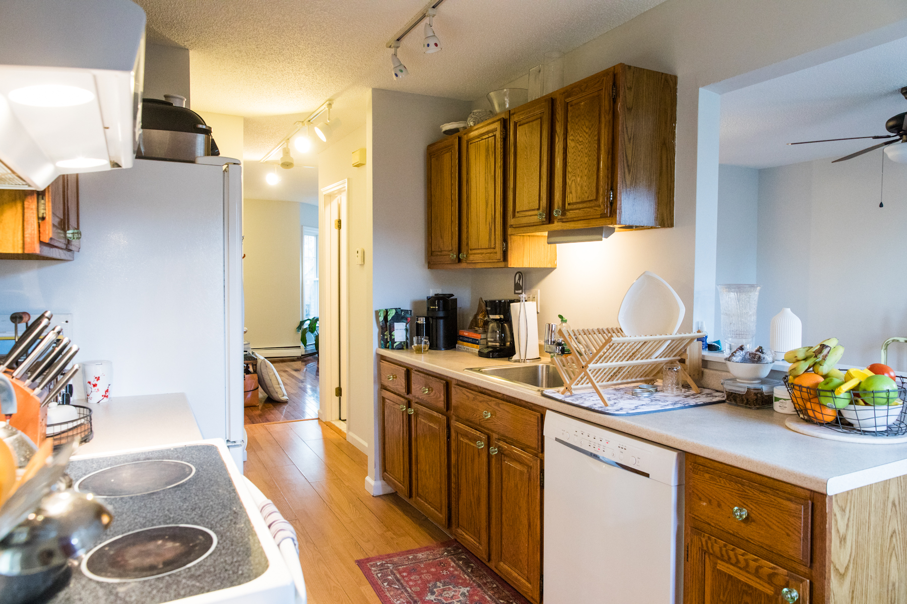
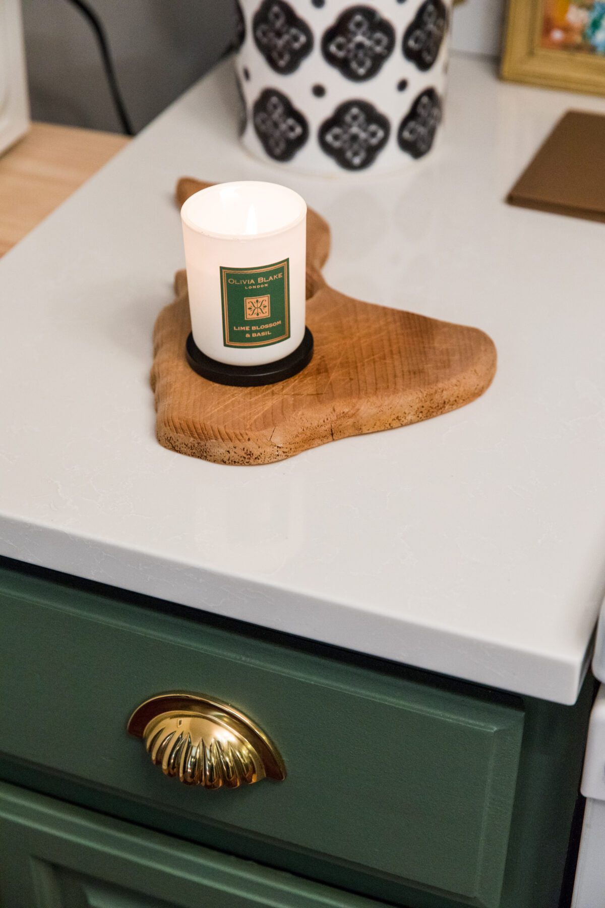
In the kitch sitch, we are reminded of the amazing things paint can do. A soothing gray-green, polished gold hardware and newly spray painted hinges breathes new life into the formerly dark and dated wood cabinetry.

A faux marble and gold backsplash adds a playful texture, and the coolest part: it’s peel-and-stick! Looks fantastic and is an excellent cost saver.
There was zero option on the old track lighting in here. The fixture was replaced with an asymmetrical, sputnik-like globe fixture emphasizing the ceiling height and, in turn, making the kitchen feel larger.


I concealed the rubbish bins by placing a pull-out trash can inside one of the cabinets and placing the recycling bin in the rolling, black island. You can’t see it and that’s how we like it.
We’d saved so many bucks that my client decided late in the process to take the plunge on quartz countertops. This design decision made the kitchen look like a million bucks.


THE POWDER ROOM
Lastly, the precious powder room was just so plain. Vibrant teal walls complement the existing floor tile and gold fixture upgrades took this petite bath to the next level.


These particular clients are so hands-on and I love it!! As an interior stylist, I work with people whose level of DIY savvy is completely different from one to the next. I can do it all or I can tell you what to do—whatever works for you, works for me, too!
That being said, these two do not mess around and, quite literally, did it themselves. The wallpaper, the paint, the stencils, hanging curtains, you name it, they did it. Huge kudos for their participation in this incredible transformation.
Cheers to your beautiful home! 🥂
What’s your favorite aspect of this remodel?
Leave a comment below!

BEFORE & AFTER


